


.png "English")


Πέμπτη 24 Μαρτίου 2016
Push CSS3 Down Panel

χρησιμεύει στο να εξοικονομούμε χώρο στην σελίδα μας!Είναι ένα widget push down
panel με κώδικα CSS3!
Eάν έχουμε μεγάλα κείμενα, περιγραφές για οτιδήποτε, αυτό το widget
είναι ότι περιέχοντας ακόμα και Links!
Στην αρχική εμφάνιση
του φαίνεται όπως στην εικόνα δεξιά ,
σαν κουμπί και η συνέχεια στο Demo...
Για να το εγκαταστήσετε και εσείς...
Πηγαίνετε blogger--> Διάταξη -->
Προσθήκη gadget-->HTML/JavaScript
και στο παράθυρο που θα ανοίξει επικολλήστε τον ακόλουθο κώδικα-->
..............................................................................................................................................................
Προσθήκη gadget-->HTML/JavaScript
και στο παράθυρο που θα ανοίξει επικολλήστε τον ακόλουθο κώδικα-->
..............................................................................................................................................................
<style type="text/css">
div.css3droppanel { /* Main wrapper for push down panel */
position: relative;
margin: 0;
margin-bottom: 1em; /* margin with rest of content on page */
}
div.css3droppanel > div { /* Content DIV DIV inside wrapper */
height: 10px; /* initial height of content when hidden. Should be same height as bottom bar (see div.css3droppanel:after) */
padding: 5px;
-moz-box-sizing: border-box; /* ensure any padding and border declared inside content DIV doesn't increase DIV's declared dimensions */
-webkit-box-sizing: border-box;
box-sizing: border-box;
overflow: hidden;
background: #b5e5e0; /* background of content DIV */
position: relative;
opacity: 0;
-moz-transition: all 0.2s ease-in-out 0.1s; /* CSS3 transition of UL state. Last 0.1s specifies delay before animation */
-o-transition: all 0.2s ease-in-out 0.1s; /* instead of ease-in-out, also try cubic-bezier(0.25, 0.1, 0.25, 1.4) instead */
-webkit-transition: all 0.2s ease-in-out 0.1s;
transition: all 0.2s ease-in-out 0.1s;
}
div.css3droppanel:after { /* Add bottom bar beneath wrapper */
content: '';
display: block;
bottom: 0;
position: absolute;
width: 100%;
height: 10px;
box-shadow: 0 3px 8px gray, 3px 3px 4px brown inset;
background: #5a1619; /* dark redish background and its gradient versions */
background: -moz-linear-gradient(top, rgba(118,36,41,1) 0%, rgba(117,5,11,1) 50%, rgba(56,38,39,0.72) 100%);
background: -webkit-gradient(linear, left top, left bottom, color-stop(0%,rgba(118,36,41,1)), color-stop(50%,rgba(117,5,11,1)), color-stop(100%,rgba(56,38,39,0.72)));
background: -webkit-linear-gradient(top, rgba(118,36,41,1) 0%,rgba(117,5,11,1) 50%,rgba(56,38,39,0.72) 100%);
background: -o-linear-gradient(top, rgba(118,36,41,1) 0%,rgba(117,5,11,1) 50%,rgba(56,38,39,0.72) 100%);
background: -ms-linear-gradient(top, rgba(118,36,41,1) 0%,rgba(117,5,11,1) 50%,rgba(56,38,39,0.72) 100%);
background: linear-gradient(to bottom, rgba(118,36,41,1) 0%,rgba(117,5,11,1) 50%,rgba(56,38,39,0.72) 100%);
}
div.css3droppanel input[type="checkbox"] { /* style invisible checkbox element used to toggle state of push down panel */
position: absolute;
right: 50px; /* right position of checkbox */
width: 60px; /* width of checkbox */
height: 42px; /* height of checkbox */
bottom: -34px; /* bottom offset of checkbox */
z-index: 10;
cursor: pointer;
opacity: 0;
}
div.css3droppanel input[type="checkbox"]:checked ~ div { /* when checkbox is checked, expand content within wrapper */
height: 250px; /* height of content to expand to. Scrollbar will be shown if content overflows this height */
opacity: 1;
overflow: auto;
}
div.css3droppanel label { /* style label that's positioned below wrapper's bottom bar, and will toggle checkbox when interacted with */
position: absolute;
right: 50px; /* right position of label */
width: 60px; /* width of label */
height: 42px; /* height of label */
bottom: -34px; /* bottom offset of label */
border-bottom-left-radius: 30px;
border-bottom-right-radius: 30px;
cursor: pointer;
z-index: 5;
background: #5a1619; /* dark redish background and its gradient versions */
background: -moz-linear-gradient(top, rgba(118,36,41,1) 0%, rgba(117,5,11,1) 50%, rgba(124,31,32,0.72) 100%);
background: -webkit-gradient(linear, left top, left bottom, color-stop(0%,rgba(118,36,41,1)), color-stop(50%,rgba(117,5,11,1)), color-stop(100%,rgba(124,31,32,0.72)));
background: -webkit-linear-gradient(top, rgba(118,36,41,1) 0%,rgba(117,5,11,1) 50%,rgba(124,31,32,0.72) 100%);
background: -o-linear-gradient(top, rgba(118,36,41,1) 0%,rgba(117,5,11,1) 50%,rgba(124,31,32,0.72) 100%);
background: -ms-linear-gradient(top, rgba(118,36,41,1) 0%,rgba(117,5,11,1) 50%,rgba(124,31,32,0.72) 100%);
background: linear-gradient(to bottom, rgba(118,36,41,1) 0%,rgba(117,5,11,1) 50%,rgba(124,31,32,0.72) 100%);
box-shadow: 0 3px 8px black, 5px 5px 6px brown inset, 0 -3px 3px rgba(152,41,47,0.7) inset, 0 5px 0 rgba(255,255,255,0.7) inset;
}
div.css3droppanel label:hover { /* style of label when mouse rolls over it */
box-shadow: 0 3px 8px black, 5px 5px 6px brown inset, 0 -3px 3px rgba(152,41,47,0.7) inset, 0 5px 0 rgba(255,255,255,0.7) inset, 0 0 15px rgba(255,255,255,0.8) inset;
}
div.css3droppanel label:after { /* generated down arrow */
content: '';
position: absolute;
display: block;
width: 0;
height: 0;
border: 12px solid transparent;
border-color: white transparent transparent transparent;
top: 18px;
left: 18px;
box-shadow: 0 0 7px gray inset;
}
</style>
<!--[if lte IE 8]>
<style>
/* Hide panel from IE8 and below */
div.css3droppanel {
display: none;
}
</style>
<![endif]-->
<div class="css3droppanel">
<input type="checkbox" id="paneltoggle" />
<label for="paneltoggle" title="Click to open Panel"></label>
<div class="content">
<!--panel content goes here-->
<p>ΕΔΩ ΒΑΖΕΤΕ ΤΟ ΚΕΙΜΕΝΟ ΣΑΣ</p>
<p>
ΤΙΤΛΟΣ ΛΙΝΚΣ: <a href="ΔΙΕΥΘΥΝΣΗ URL">TITΛΟΣ</a>, <a href="ΔΙΕΥΘΥΝΣΗ URL">TITΛΟΣ</a>, <a href="ΔΙΕΥΘΥΝΣΗ URL">TITΛΟΣ</a>.
</p>
<!-- end panel content -->
</div>
</div>
....................................................................................................................................................................
ΑΛΛΑΓΕΣ
Γράφετε το κείμενο που θέλετε στο ΕΔΩ ΒΑΖΕΤΕ ΤΟ ΚΕΙΜΕΝΟ ΣΑΣ
ΤΙΤΛΟΣ ΛΙΝΚΣ --Εδώ βάζετε τον τίτλο επικεφαλίδα για τα link σας!
και βάζετε την διεύθυνση του link σας και τον τίτλο του στα αντίστοιχα πεδία!!
Αποθήκευση και έτοιμοι!!
Πηγή κώδικα
thanks to dynamicdrive.com
Edit by


Εγγραφή σε:
Σχόλια ανάρτησης
(
Atom
)
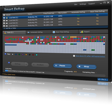
Smart Defrag 2
Γειά σας σε αυτήν την ανάρτηση θα δούμε το Smart Defrag 2 ένα από τα καλύτερα προγράμματα ανασυγκρότησης των σκληρών μας δίσκων...

Auto Scrolling Recent Posts
Γειά σας ένα πολύ ωραίο widget με οριζόντιο Auto Scrolling για να παρουσιάζουμε τις πρόσφατες αναρτήσεις μας...
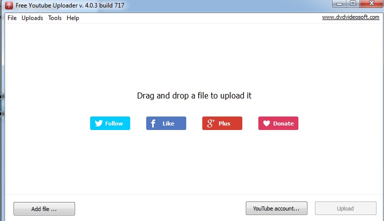
Free YouTube Uploader
Γειά σας σε αυτήν την ανάρτηση θα δούμε το Free YouTube Uploader το οποίο μας επιτρέπει...

Social media
Γειά σας τα gadgets και widgets για τα social media δεν έχουν πλέον τελιωμό και σε αυτήν την ανάρτηση θα δούμε...
Back to top button
Γεία σας σε αυτήν την ανάρτηση θα δούμε ένα πολύ γνωστό και χρήσιμο gadget το οποίο μας βοηθά έτσι ώστε...
Sitemap Widget
Γειά σας,σε αυτήν την ανάρτηση θα δούμε ένα πολύ ωραίο και χρήσιμο Sitemap widget το οποίο μας δείχνει μαζεμένες σε μία σελίδα...


Αυτή η εργασία χορηγείται με άδεια Creative Commons Αναφορά Δημιουργού-Μη Εμπορική Χρήση-Όχι Παράγωγα Έργα 3.0 Ελλάδα .


0 σχόλια :
Δημοσίευση σχολίου